💡 Guide to add Tikz Plots in Latex
Tikz Plots
Tikz plots are very useful to add graphs in your publication.
Example
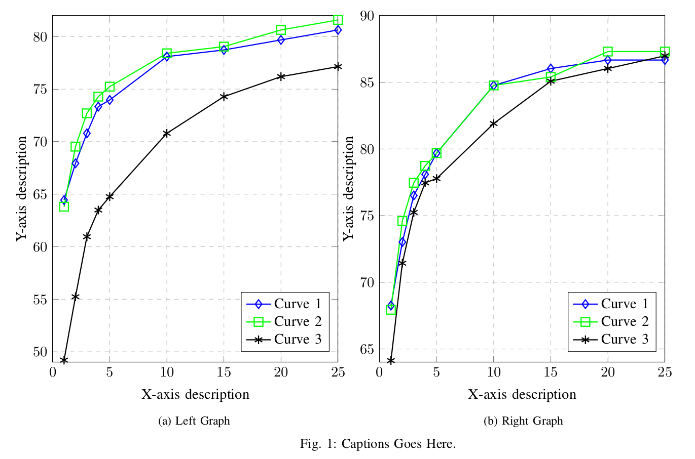
I use dat file for each curve of a graph. Consider, you have 3 curves. You put data of each curve to its corresponding file, and follow the step below for plotting. Its simple text file with extension dat. You can choose any other extension too. It is two columns file. First column corresponds to the x-axis values and second column corresponds to y-axis.
1 64.444
2 67.937
3 70.794
4 73.333
5 73.968
Explanation
Since most of the plots have some similar axis’s information, so
tikz-graph-in-latex/tikz_styles.tex file is used for controlling default values. For instance, X-Y ticks and X-Y labels defaults values can be assigned in this tikz_styles.tex file.
X-Y Ticks
Open the file tikz-graph-in-latex/tikz_styles.tex and change xtick and ytick like below
xtick={0,5,10,15,20,25},
ytick={45,50,55,60,65,70,75,80,85,90,95,100},
X-Y Labels
Open the file tikz-graph-in-latex/tikz_styles.tex and change xtick and ytick like below
xlabel={X-axis description},
ylabel={Y-axis description},
Y-Axis Max and Min
Sometimes, Y-axis doesn’t fit the plot well. So we control y-axis for each plot in the main.tex file.
Open the file tikz-graph-in-latex/main.tex and change xtick and ytick like below
\pgfplotsset{ymax=82, ymin= 49}
Similarly, you can also control x-axix min and max value.
Curve Settings
Open the file tikz-graph-in-latex/main.tex and change color, mark, size and line width for each curve accordingly.
\addplot [color=blue, mark=diamond, mark size=3pt, line width=0.8pt]
Source Code
You can clone the example repository from our :octocat: Github page.
⭐️ If you like this repository, give it a star on GitHub! ⭐️

